Users frequently struggle to find relevant information, highlighting a usability issue that hampers the overall user experience and leads to a significant increase in repetitive inquiries and higher drop-off rate.
My Role
Built and managed a product design team of 3
Goal
Improve the findability of relevant information on the platform to reduce user struggle
Results & Learning
The objective was to establish a seamless and intuitive workflow, guaranteeing that users, irrespective of their expertise level, can navigate effortlessly.
Key Challenges - #1
A comparative analysis across existing podcasting platforms suggested that the podcast creation process was largely fragmented. While this was not a big challenge for international podcasters, it was a roadblock for Indian creators due to the nascency of the medium.
Can I use my phone to record?
What is an RSS feed?
How can I distribute my podcast?
How do I promote my content?
Overwhelming process to create, publish and distribute podcasts
START
Choosing
concepts &
ideation
Picking formats
& writing scripts
Select the right
microphone
Booking a
studio or
finding a room
Recording the
episode
Choosing an
editing software
Cutting the fillers
(umms, ahs,
mistakes)
Adding Pre
Post-Rolls &
sound effects
Cleaning the
audio & adding
background music
Exporting
to .mp3
Signing up for a
hosting platform
Creating podcast
channel &
uploading .mp3
Generating an
RSS
Manually
distributing the
podcast using the
RSS feed
Creating
promotional
material
Going on separate
platforms to track
analytics
1
2
3
4
5
6
7
8
9
10
13
14
15
16
FINISH
11
12
Observation - #1
The boxes above also serve as the most recurring frequently asked questions in the help section of the website.
Observation - #2
It was observed that the churn rate increased when creators navigated from a page to the help section.
So what is the problem?
How to reduce the churn?
The most straightforward solution is to prevent the creator from leaving the current page and ensure all the necessary information is readily available to them right where they are.
Enters the hero of the story
’Information architecture’
When done correctly, you get a pat on the back from the business team😉
My team and I iterated on numerous wireframes, incorporating essential details into the 'i' section, expanding information within help section, and optimizing walkthroughs.
But, these didn’t seem right.
Eureka moment!
Sometimes you don’t need big design changes to make a difference
Learning resources
Here are some of the ways of distributing with
Hubhopper:
Automated Distribution: Teams make it easy for multiple people to work on a podcast. This can be helpful for podcasts with multiple hosts or for podcasts that require a lot of editing.
Manual Distribution: Teams make it easy for multiple people to work on a podcast. This can be helpful for podcasts with multiple hosts or for podcasts that require a lot of editing.
Learn More
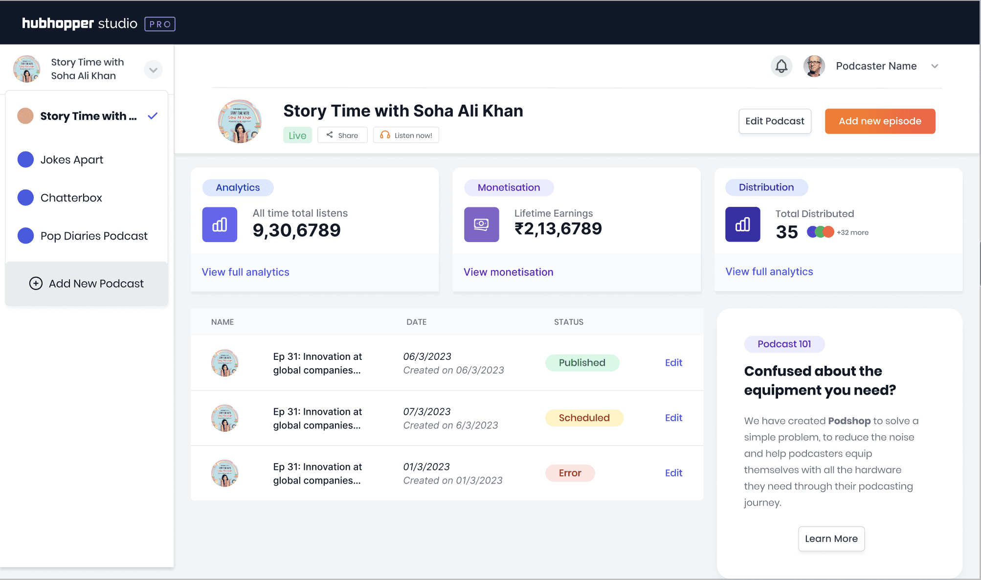
A ‘help box’ thats consistent on all pages
What does this ‘help box’ do?
By adding this help box to the structure, we made it a part of the layout pan-product. This enables all teams within the company to easily communicate with creators (users).
The control of this box was established through Retool, allowing teams across the organization to access it without requiring tech team’s intervention for updates.
Marketing
Built and managed a product design team of 3
User research, prototyping, UI design
Business
The goal was to create a seamless and intuitive workflow, ensuring that users, regardless of their level of expertise, can navigate effortlessly.
Product
Built and managed a product design team of 3
User research, prototyping, UI design